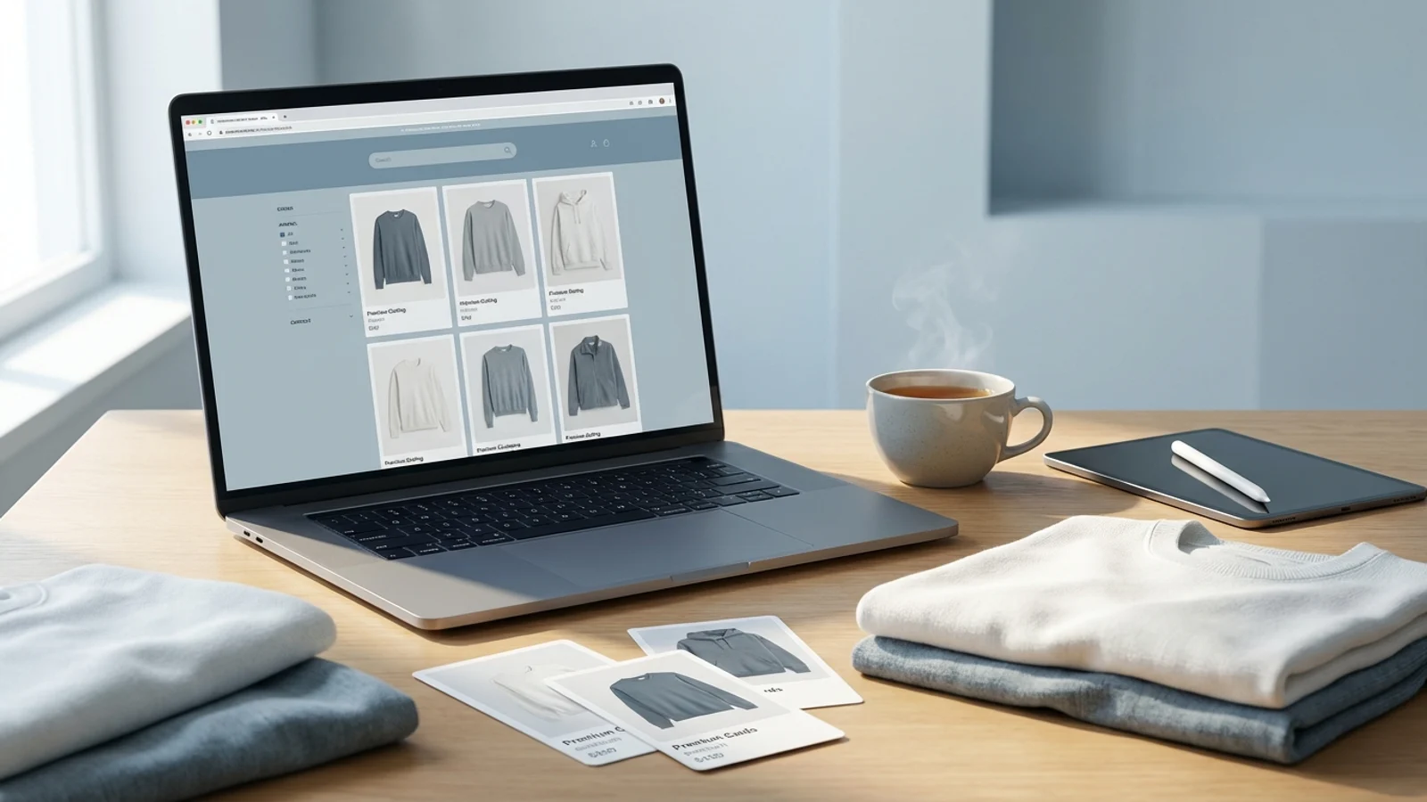
On Trendyol, the visual is the first point of contact
On Trendyol, shoppers often make a quick decision among dozens of products on a search results or category listing screen. At that moment, before reading the product name or description in depth, their eye goes to the visual. In other words, the product image is not merely an aesthetic element; it is the main storefront that directly affects your chance of getting a click. Especially in the Turkish market where mobile usage is dominant, it is very important for the product to be clearly understood in the first frame.
What this means is this: a Trendyol product image should be designed around the speed of the shopper’s decision making rather than around the brand’s campaign universe. Visuals that are too crowded, low in contrast, that cause the product to lose its form, or that do not match category expectations can lower the click-through rate. A product image should be plain, reassuring, and structured to convey the product clearly.
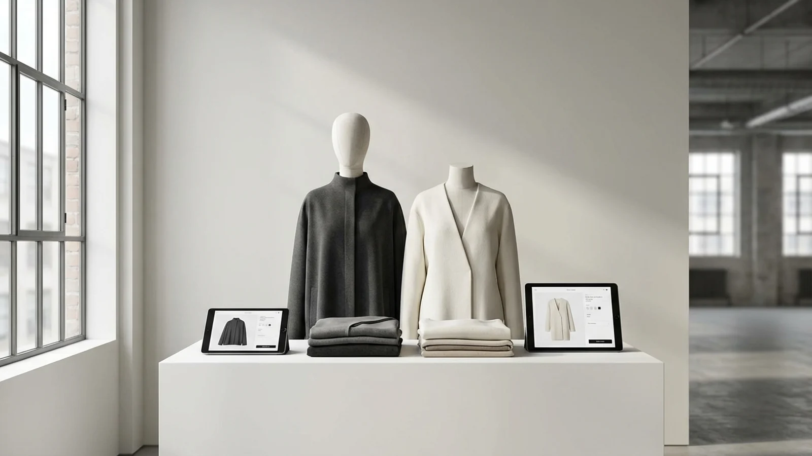
The core goal of the main image: instantly conveying what the product is
In the main image, the thing the shopper looks for fastest is what the product is. That is why the form of a bag, the product type of jewelry, the main silhouette of clothing, and the frame shape of eyewear should be understood at a glance. Unnecessary accessories, a confusing background, or compositions where the product appears too small weaken performance. If the shopper is wondering “what exactly is this” in the first second, it means the visual is not doing its job fully.
To make the visual more striking, some brands use heavy effects, excessive decor or aggressive cropping. Yet in marketplace logic, simplicity often works better. The product should be the main actor. This becomes even more critical in category structures that use a white or light background. When the visual is clean, the product’s price-performance perception also looks more trustworthy.
- The product should appear large enough in the frame
- The background should not overpower the product
- Color and form should not be distorted
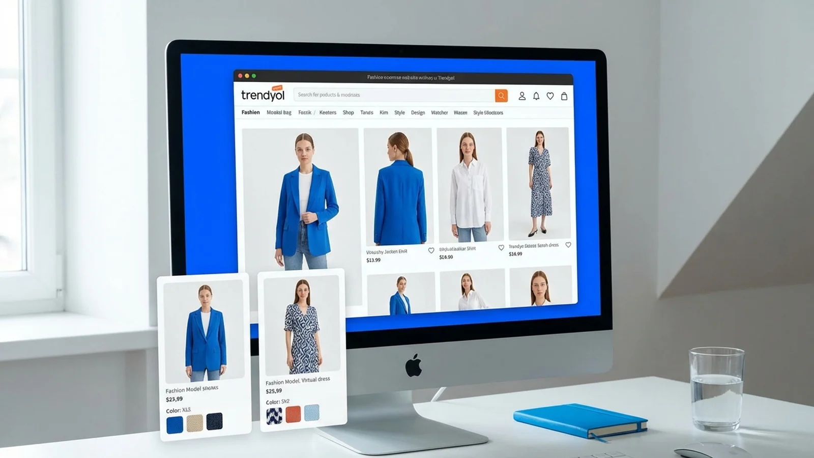
Supporting images complete the persuasion process
Focusing only on the main image on Trendyol is an incomplete strategy. Because after a shopper clicks on the product, they move on to the supporting images and finalize their decision there. Visuals such as a close-up of a stone in jewelry, a zipper and inner volume in a bag, a back view and fabric texture in clothing, and a side view of eyewear reduce the shopper’s hesitations. In other words, supporting images serve a question-answering function.
This is where AI-powered visual production provides a significant advantage. It is possible to take a single catalog shoot and generate additional lifestyle versions, usage scenarios and detail-focused scenes from it. However, the main image still needs to be the simplest and clearest version. In the supporting images, the brand story and the context of use can be played up a little more strongly.
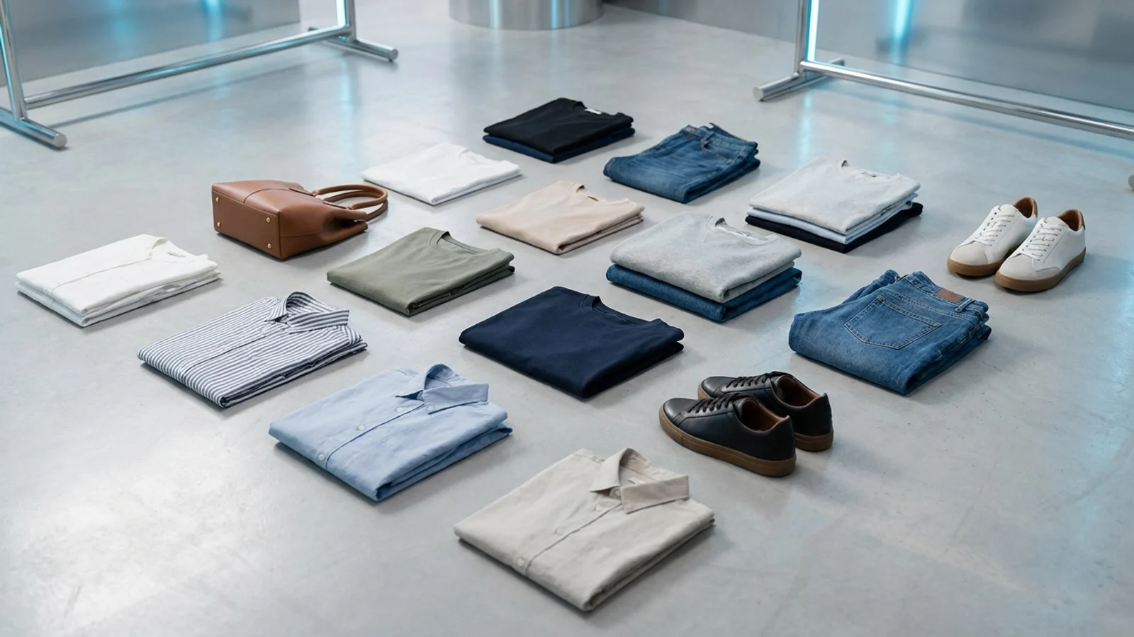
The right visual language changes by category
On Trendyol, clothing, jewelry, cosmetics, bags and eyewear should not be presented with the same logic. While on-model use can be more persuasive for clothing, detail and reflection control are more important for jewelry. For bags, lifestyle frames can be supportive in conveying a sense of use. For eyewear, different face types or close-up frame use builds trust. For this reason, it is wiser to create separate visual templates for each category.
For sellers in the Turkish market with a high number of SKUs, this separate-template approach provides both scalability and performance tracking. Questions such as which category gets more clicks with which type of visual, which products perform better with a white-background main image, and which products see model use support conversion can be answered more clearly.
How should you think about SEO-like visibility logic for Trendyol?
Classic Google SEO logic does not apply identically inside a marketplace; however, there is a visibility logic. If the product image gets clicks, if page engagement strengthens, and if the shopper examines the product more, the performance signals can be positively affected. For this reason, visual optimization should not be considered separately from the title. Title, price, reviews and visual all work together.
The best approach is to set up a regular testing system per product. You need to make the main image clearer, strengthen the supporting images, show different uses, and check how quickly the product is understood in the mobile view. A Trendyol product image should be a concern not only of the design team but also of the growth team.
Sources